
Two 15-minute appointments, 200+ hours of design, a complete wardrobe delivered to your door.
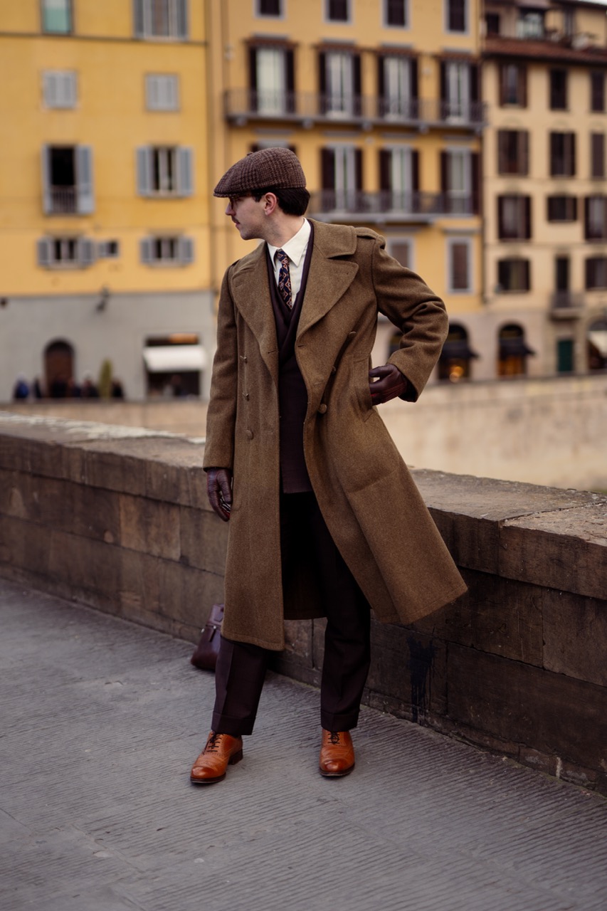
Apply for a ConsultYou have a closet full of clothes and nothing to wear, the feeling standing there before a dinner, a board meeting, a trip. Grabbing the same safe option because you don't have time to think about it.
We fix that permanently with one meeting, and one fitting for a complete wardrobe designed around your life. Delivered to your door with a dressing guide that makes getting ready take 5 minutes.
From here, reorders are a text message.
See how it works in detail →
We fly to wherever you are with hand-selected fabrics from the world's best mills. You approve what you like, we take your measurements, and you are done. Total time: 15 minutes.
We return with fitting garments tailored to your body. You try them on, we make adjustments down to the centimeter. Another 15 minutes. Then we disappear and build your wardrobe.
Your finished wardrobe arrives with dressing guides and every item matched, every outfit mapped. From here, reorders are a text message, the hard part permanently behind you.

— Damien Broderick, Jewelry Business Owner & Entrepreneur, 3 million audience Instagram and YouTube
New York, London, Dubai, Hong Kong, wherever you are, we come to you. Two 15-minute appointments, scheduled around your calendar. No showrooms, no waiting rooms, no wasted trips, your schedule is the only one that matters.
See If You QualifyRead our story →